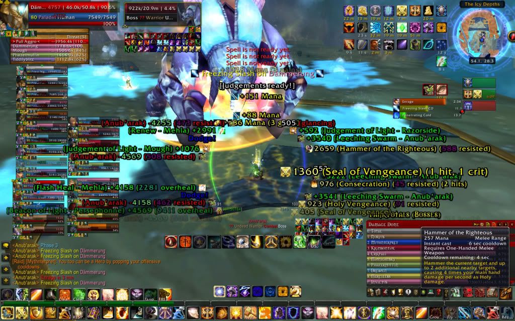
As you can see, I've got quite the clutter going on. A lot of people who post about their UIs talk about how they wanted a clean UI, a functional UI, a UI worthy of posting about. I had none of those ideals in mind when I built my UI. It was put together, piece by piece, like some sort of Frankenstein's Monster. It evolved as my needs evolved. And now, like any end result of evolution, has many vestigial organs that I can certainly live without.
I used the default UI until I was almost level 80. I had no idea what addons were, or how useful they could be. As I took a more and more involved role in the endgame, I picked up addons here and there as issues arised, and never really took the time to do any pruning. So here's a list of what addons I use, what purpose they serve, and what drove me to take them.
Omen: Threat Meter was required to raid by my first guild, which exploded a week before I was ready to start raiding. But hey, at least I got Omen out of it!
DBM: Same as Omen.
Bartender4: Very quickly after hitting level 80 did I come to the realization that 10 abilities just wasn't going to cut it. Now I have over 40 available, and I use almost all of them.
Pallypower: I got sick of spending 20 minutes sorting out which pally was buffing what.
Recount: I couldn't figure out why Thaddius wasn't dying, I picked this up to find out who was only pulling 2k.
Sexymap: Wanted coordinates to track down a quest obective in Icecrown.
Icehud: Got sick of looking at the corner to check on health and mana, so I got it setup right by my character.
Parrot: Gives me a feel for the pacing of the fight, and net heals without having to sift through recount.
Pitbull: As I became more experienced as a raid leader, I realized that raid frames have their uses. I have mousover macros tied into all my hand spells and cleanse on pitbull. Plus it lets me track who's dead, who's dying, and who's dangerously oom.
Tanktotals: it's hidden above recount, but it gives me a mouseover log on some of my more important survival and mitigation numbers whenever I want to check them.
There's a lot of things that I plan on eventually cleaning up with my UI. But right now, it's functional, if ugly. I've got all the information I need to make informed decisions as a raid leader, and as a tank. In some cases three times over...
I'd love to show you what my UI looked like the day my old guild killed the last boss in Karazahn, it was pretty close to what this looks like, possibly more cluttered (I ran both Omen and KTM because people were not fully transitioned to Omen yet). I'd also love to share what it looks like now, I'll try to upload a screenshot tonight and get you a link.
ReplyDeletePlease tidy up your UI, TMR. It hurts my brain. :)
ReplyDeleteOne simple thing you could do, is remove useless information from your scrolling text. You can just delete (untick) the info you don't need. Like, the seal of light procs. Do you really need to see that? Do you need to see consecration damage output?
Hey, Just a bit of advice if you would want it. I dont know how big ur moniter is but you can install a veiwport addon, something like aperture 2, and basically push ur screen to whatever area you wanted it to be. The thing I found most helpfull with it was to create a large bar at the bottom of my screen and fill my addons into said bar and free up all of my screen realestate so I could see the enemy's i was supposed to tank. :)
ReplyDeleteO and I also forgot TipTac is a wonderfull addon to move the tooltip window that constanly appears over your recount.
ReplyDelete